A new User Interface, with its own layout and art, can help attract players and convey information and character in a way that’s unique to your game. I want to talk about our experience with Restless – a small(ish) game where you haunt a house and try to make peace with its inhabitants. I hope this post can be a useful tool for others looking to make their own UI, especially in text-heavy games, or those where the bulk of the game is in its interface.
First, a bit of background on Restless. Destina and I worked on its UI, art and Unity development full-time for two weeks. A portion of the writing and design had already been done (by the amazing Emily Short) and the game’s backbone was in Spirit AI’s Character Engine. This means that when we started we already had a game to test, and knew what we were working towards – what kind of mood, characters and story we wanted to complement. The bulk of the work we did can be divided in two parts.
Part 1 – The User Interface
Restless is a game where you choose what to say, but your options are based on the situation as well as two other factors – your emotions and the topics you want to bring up. Since you’re a ghost who has trouble communicating, the limited options are framed in the game itself.
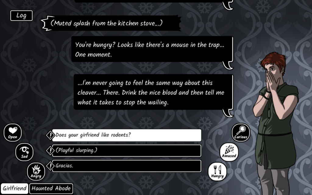
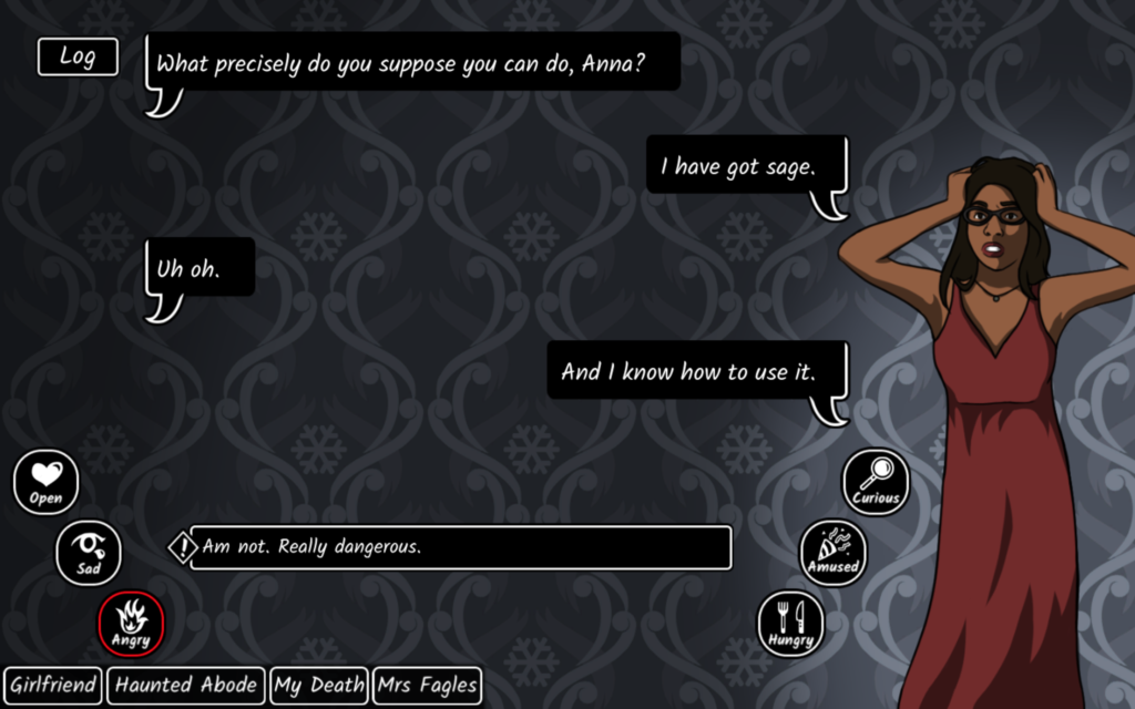
One of our biggest challenges was creating an interface with lots of elements that were visually distinct, but still clear in their functions. If you look at the image above you’ll see:
- An ongoing conversation in the top-middle portion of the screen. This is what you’re saying or doing as a result of your actions, as well as the NPC’s responses. It’s not something you interact with directly.
- Your options (below that) change depending on various factors. There are usually three, and those marked with ‘!’ are only available for the subsequent action. You click one of these to continue the conversation.
- Your emotions (either side of the options) are toggled on and off, and you can have any combination of them active.
- The topics you want to bring up (bottom left) are also toggled on and off, but you can only have one active at a time. Both topics and emotions affect the options you have available, as well as their wording.
- The log button (top left) opens the text log when clicked. This lets you reread earlier parts of the conversation.
We settled on the elements after a handful of iterations. All clickable buttons are black with white borders/text, but we reverse those colours while they’re active, making them white with black borders/text. As a ghost story, a black and white UI was a good fit, and also provided good visual contrast. However, there were four different kinds of buttons, and we wanted to make that clear. Some are more rounded than others, some shrink to fit the text while some don’t, some have icons and others fit together in a black ‘tray’. While they’re not striking differences, they make it clear that each type of button has a different function. The conversation (which is non-interactive) has only partial borders, to make it look less click-able.
That explains the button shape and colour, but why did we lay them out like that?
- The ongoing conversation is the most important, so it should be in the centre. We wanted players to be able to read a few bubbles at a time, so this section is as large as we could make it while fitting in all the other elements.
- The options should be adjacent, since the option you choose will become part of the conversation. Having a choice below conversation text is relatively easy for players to understand – it’s used in other places like online messaging, so it’s a good default.
- The emotion buttons and the topics both affect the options, so they should be near them. The emotions fan around the options, as you get all six fairly quickly, and they fill that space well. The topics unlock over time (and only if you find them), so they’re a list that grows out as new elements are added.
We also had to consider the text itself. We aimed for a size large enough to be read comfortably, but small enough that the screen didn’t feel cramped. The font itself was chosen from Google Fonts to match the atmosphere of Restless while being easy to read.
Part 2 – Text Movement and Deployment
Things look so much better when they animate and move around! We had been playing around with text and UI effects in our own games, so we knew we wanted Restless to benefit from our experimentation.
Words appear one at a time, with a short pause at commas and a longer one at periods. This imitates speech, but in a way that can easily be automated. It’s something players may not notice, but the effect (especially in a speech bubble, next to an image of a character) can be quite powerful!
In addition to talking, the ghost in Restless can make sounds from various parts of the house. We wanted those to stand out, since it’s something unique to this game, so we used a different speech bubble and made individual letters jitter.
We also had to choose how to animate the speech bubbles themselves. They come in from below, pushing older ones up and out – since we have a text log, there wasn’t much worry of the player ‘missing’ content off the edge of the screen. We still tried to make sure no individual text bubble was too long.
A lot of these decisions were made in conjunction with Emily Short – communication between different parts of a project can really make it come to life! We think that the finished game has some interesting UI and text effects that help set it apart, despite the short development time, and we’d love to see more consideration of text and UI elements in other text-heavy games. Reading lots of text shouldn’t have to feel like a chore! The next time you’re mapping out or sprucing up your UI, use this lens to think about your player’s experience!
If you’re looking for other sources of inspiration, check out Joseph Humfrey’s talk (Designing Text UX for Effortless Reading), or dissect games with interesting text effects (Pyre, Oxenfree, Undertale) or UI (Persona 5, Orwell, Shrouded Isle).


Add your comment